A second-hand marketplace for children's clothes, built for parents and caregivers. It combines hygiene verification, smart selling tools, and inclusive accessibility features to make trading fast, safe, and effortless — saving time and money while reducing waste
ROLE
Product Designer
(Sole Designer)
TIMELINE
4 weeks (July 2026)
TOOLS
Figma - Farmer
PROJECT SCOPE
Academic Project (Google)
End-to-End UX/UI & Branding
The Problem
01 · RESEARCH
It was conducted through survey and questionnaires to better understand:
Second-hand shopping habits
Trust and safety concerns
Selling behaviors and frustrations
Expectations for a dedicated marketplace experience



INSIGHTS
Parents struggle to quickly find the right size - Children outgrow clothing quickly, making size and age matching one of the biggest friction points during search.
Trust strongly influenced purchasing decisions - Parents are significantly more sensitive to hygiene, condition, and seller reliability when purchasing children’s products.
Sellers need low-friction onboarding to start listing items - Many casual sellers abandoned listing flows when too many upfront actions or detailed configurations were required.
Flexible delivery options, including local pickup and shipping, reduced friction and better matched different parent needs and comfort levels.
COMPETITIVE AUDIT
Most analyzed competitors lacked clear hygiene reassurance, accessible selling flows, and navigation specifically tailored to parents shopping for children’s clothing.
OPPORTUNITIES KEYS
Trust-first shopping
Clearer product condition standards and reassurance indicators for parents.
Parent-centered navigation
Faster browsing through age-based and category-focused discovery.
Low-friction selling
Simplified listing flows with reduced cognitive load and accessibility considerations.
Flexible exchange methods
02 · IDEATION
SITEMAP

LOW-FI WIREFRAMES
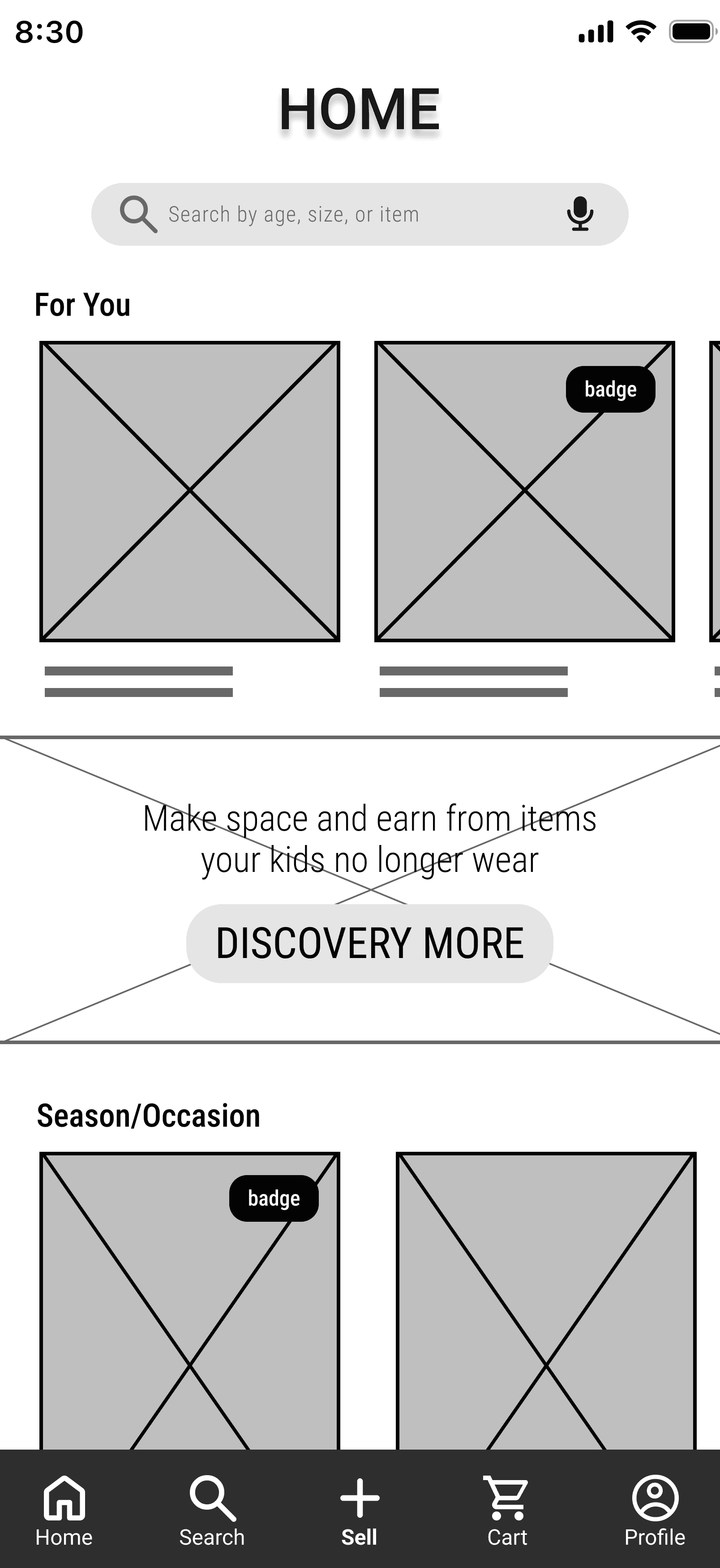
To ensure every design choice directly addresses user pain points, the early wireframes were organized and iterated around four core research insights. This approach directly bridges the gap between user friction and user-centered interface layouts.
Broswing & Discovery
Features prominent size and age shortcuts that integrate onboarding preferences directly into the feed. This dynamic layout surfaces relevant items instantly, reducing cognitive load for parents during catalog exploration.

Trust & Condition Details
Addresses the need for transparency in kids' resale by surfacing condition grades, hygiene indicators, and seller verification. Key trust markers are placed at major decision points to maximize purchasing confidence.

Simplified Listing Flow
Breaks down item creation into a progressive, low-friction wizard. By minimizing required fields and leveraging smart defaults, the layout allows busy sellers to launch a listing in just a few seconds.


Delivery Options
Segments fulfillment types early in the checkout process through a clear, binary choice between Shipping and Local Pickup. This linear structure prevents cognitive overload and adapts to different comfort levels.
03 · USER TESTING
USABILITY STUDY
To validate the early product structure, we conducted a moderated usability study with 5 parents and caregivers. The research was split into two parallel flows: the Buy Flow and the Sell Flow.
Core Goals
Validate onboarding clarity and profile configuration.
Measure usability and friction in Buy and Sell flows.
Evaluate how users interpret trust, safety and hygiene cues.
Tested Tasks
Task 1 (Buy Flow): Complete set up profile, search for an item by age, verify hygiene badges, and complete checkout.
Task 2 (Sell Flow): Publish a second-hand item listing using the progressive wizard.
KEY FINDINGS AND UX ACTION
Safety demands persistent cues
Error anxiety blocks conversion
Efficiency clashes with IA
04 · VISUAL IDENTITY & SYSTEM
The visual identity creates an inviting, reassuring environment tailored for busy parents. By blending playful elements with a refined structural system and a cognitive-light atmosphere that makes sustainable second-hand shopping feel effortless and reliable.
THE BRAND


The Logo & Name
UnNew anchors itself in an approachable character icon paired with a circular arrow, subtly referencing a sustainable clothing lifecycle. This friendly mascot humanizes the platform, building instant trust and emotional resonance with parents navigating second-hand retail.
Color Palette
Terracotta as the primary is warm, trustworthy, immediately recognizable. Sage and Sand as supporting neutrals that keep the interface calm under high information density. Every colour choice serves a parent who needs to decide fast and feel confident doing it.
Primary
Terracotta
Secondary
Sage
Tertiary
Sand
Neutral
Off-white
Neutral
Charcoal
Error
Red
DESIGN SYSTEM
01 / HEADERS & TITLES
H1 to H4 - Roboto Medium
Give your child's clothes a second life.
02 / BODY & PARAGRAPHS
Body text and caption - Roboto Regular
Every item is thoroughly inspected and hygiene-verified before shipping.
03 / ACTIONS & COMPACT DATA
Primary CTA, Secondary, Label UI - Roboto Medium & Condensed
ADD TO CART | New with tag | €18.50
Typography
Roboto carries the structure — readable at any size, reliable under pressure. Roboto Condensed steps in where space is tight: price tags, condition labels, compact controls. Two weights, one system, zero ambiguity.





Components
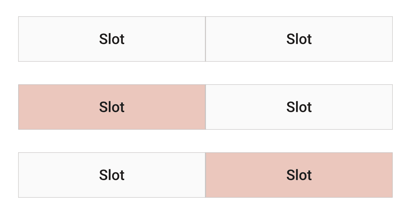
A modular component library designed for single-handed mobile navigation. features generous tap targets, responsive filter pills, and a clear 3-step checkout indicator to ensure seamless task completion during daily life.
REFLECTIONS
Starting this project, I thought I already knew what the app should look like. I was wrong — and that turned out to be the most valuable lesson.
Research and testing consistently challenged my assumptions. The quick filter chips were the last element I added, because I initially resisted them — until I accepted that what felt unnecessary to me was essential to the user.
If I had more time, I would have explored smart listing tools to improve both the selling flow and the accessibility experience. I made a deliberate choice to set them aside: I wanted to do the foundational work well before adding complexity.
My background in visual merchandising shaped more than I expected. Presentation has always been communication to me. In UX, I'm learning that it also has to be invisible.
The process is documented.
Now see where it led.